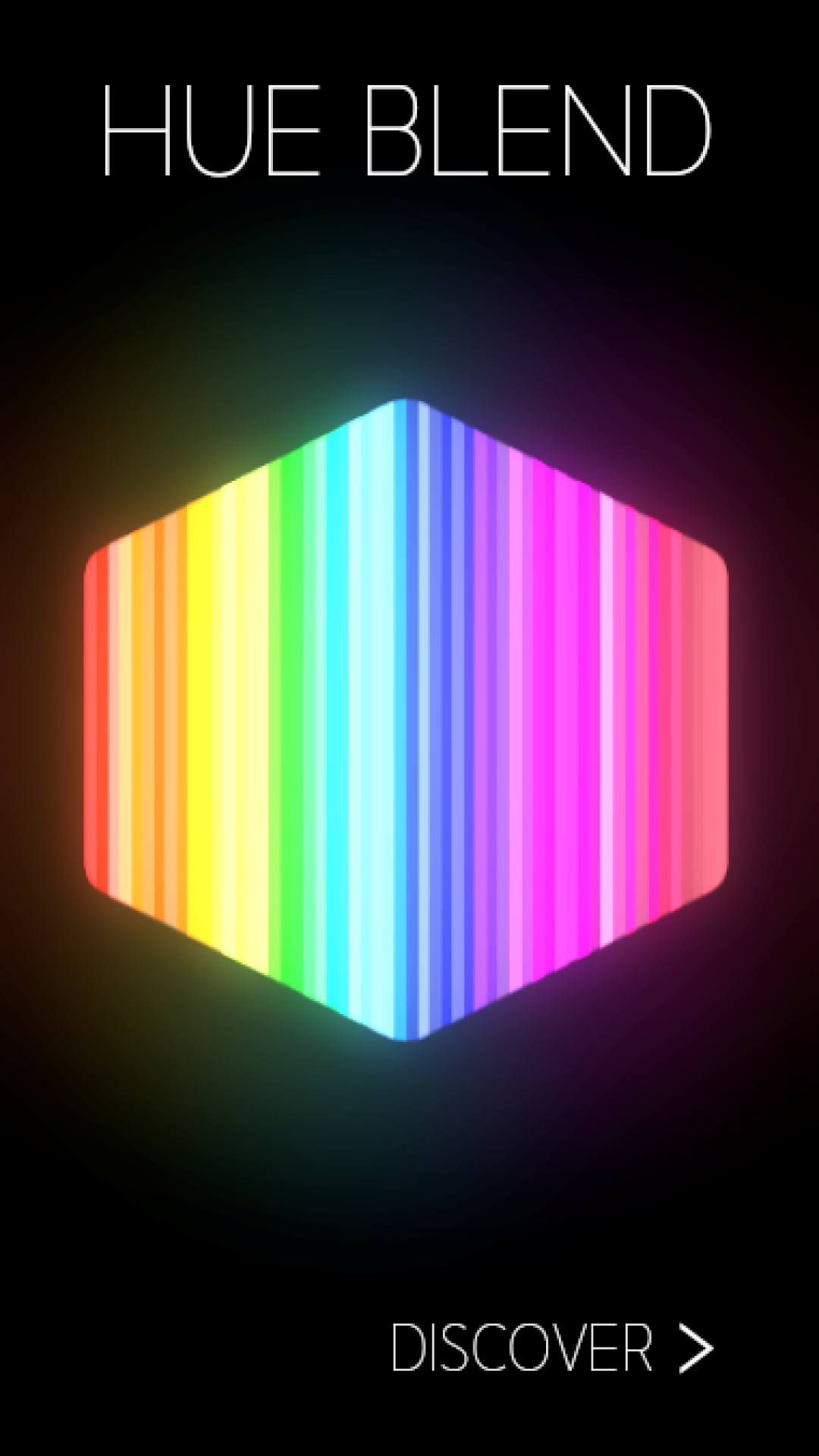
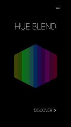
Hue Blend
Hyper-casual mobile game about mixing colors and creating beautiful unique gradients.
Key Info
Gameplay Video
Engine
Godot
Role
Technical Game Designer
Team Size
1
Production Time
5 Months
Core Design
Design Goals
Goal #1: Make a commercial ready hyper-casual game for a target audience I’m NOT part of
Goal #2: Create an experience that balances fun, relaxation, and the speed/low-commitment of mobile
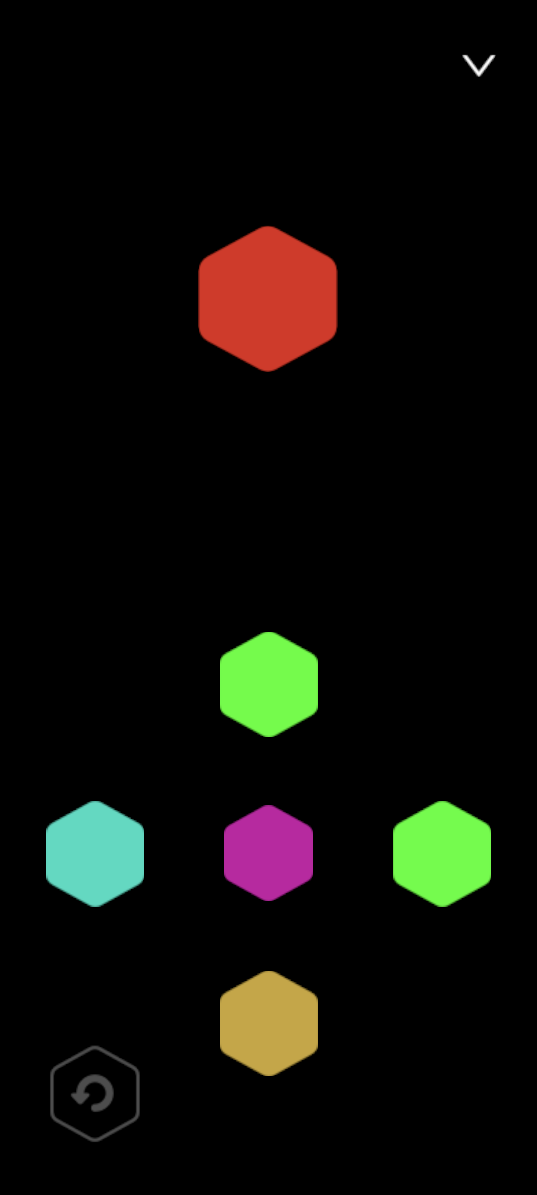
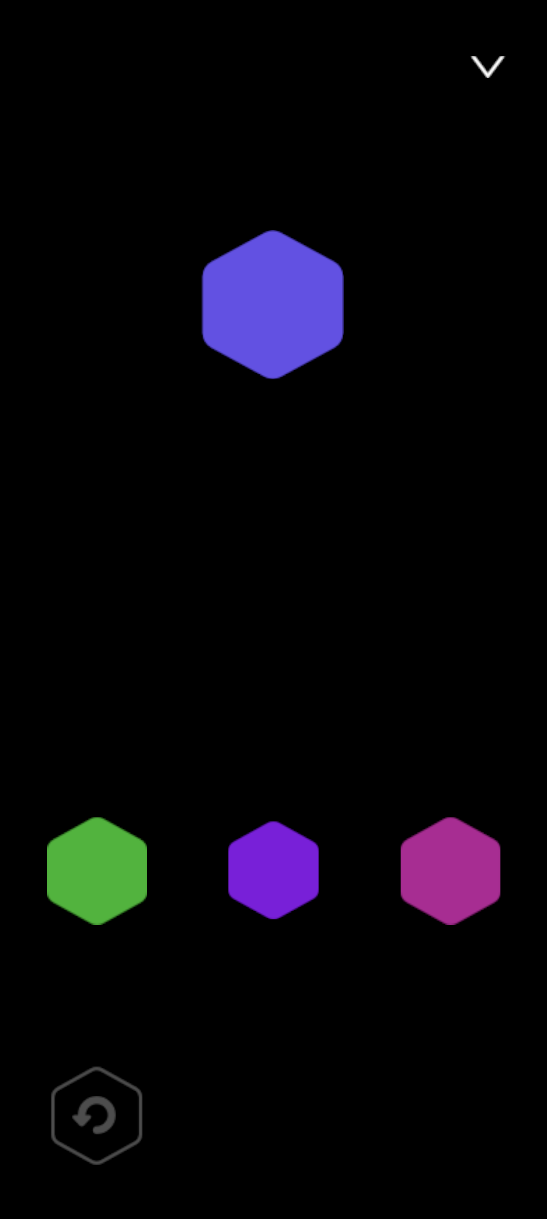
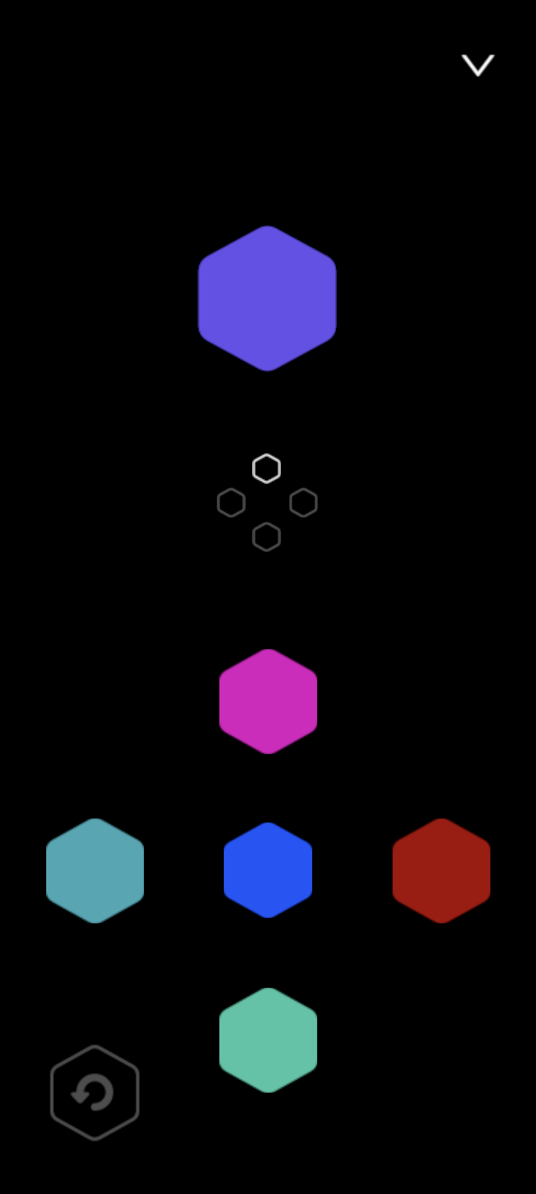
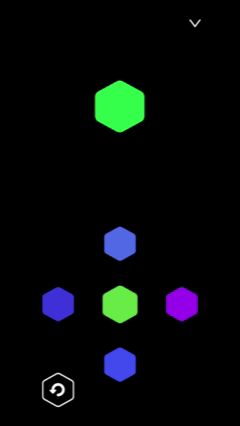
Core Game Loop
Prototyping
Design Prototype
I thought about prototyping for Hue Blend in two primary parts: design prototyping and engineering prototyping. Design prototyping was about determining the fun and interest of the game while engineering prototyping was focused on the scope of the project and determining the work effort needed to achieve it.
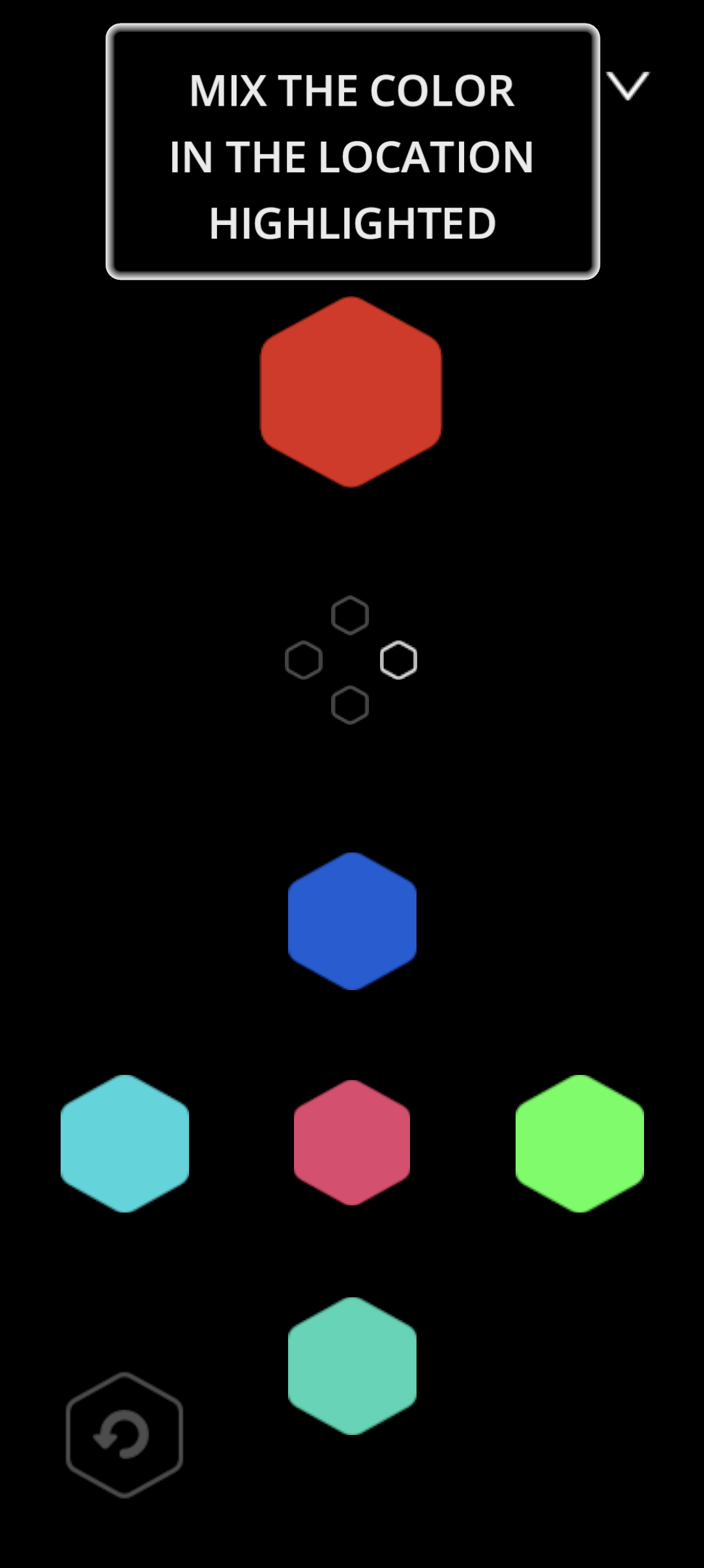
For my design prototype I needed to determine what “mixing colors” actually looked like for my game and if that was actually an interesting concept. I also wanted to test features and see how they affected the game like modes, difficulties, tracking the move count, etc.
I ultimately found that mixing colors WAS actually satisfying (yay!), but that many of the features I had were unnecessary. It was clear from playtesting that my target audience didn’t want to change difficulties or care about their number of moves, they were more focused on satisfaction of mixing colors than competition. I also found that players wanted to bright/lighten a color instead of just combining with another color, I took this learning and created shades in the final version, which only change the darkness/lightness of a color.

My first mode select screen with the scrapped difficulty feature
For my engineering prototype I needed to determine what mixing colors looked like from a code and math perspective. Simply adding or multiplying the colors did not look good, or feel natural. My technical prototype showed me a LOT about how I needed to structure my code, especially on how to compare, randomize, and mix colors.
My engineering prototype also lead to me changing quite a few of the design aspects. My original core loop had a large hexagon made of smaller ones, when the player found a color it would fill in the small hexagon that corresponds to their color and slowly create a gradient that way. I found this approach didn’t work very well, and unlock with performance issues it caused in my prototype, I ultimately shifted it to the current gradient style.
The prototype of Hue Blend… VERY hard to win this version
Engineering Prototype
Game Design
UI Design
I prototyped all of my UI screens in Figma before implementing them. I really wanted things to flow naturally and have a plan before coding away. This included all the settings screens, mode select, main menus, gameplay, etc.
My Figma mockups and the final production version
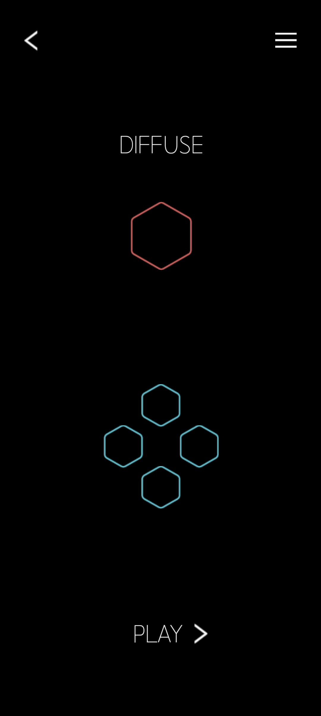
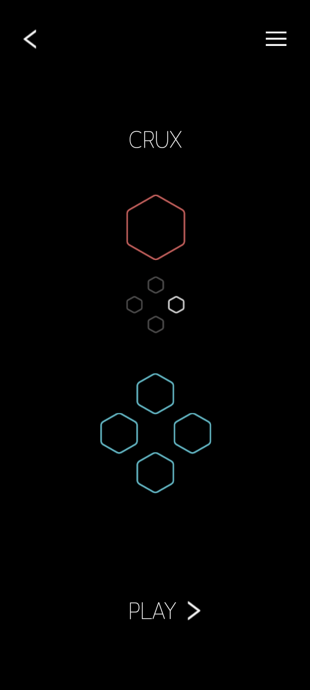
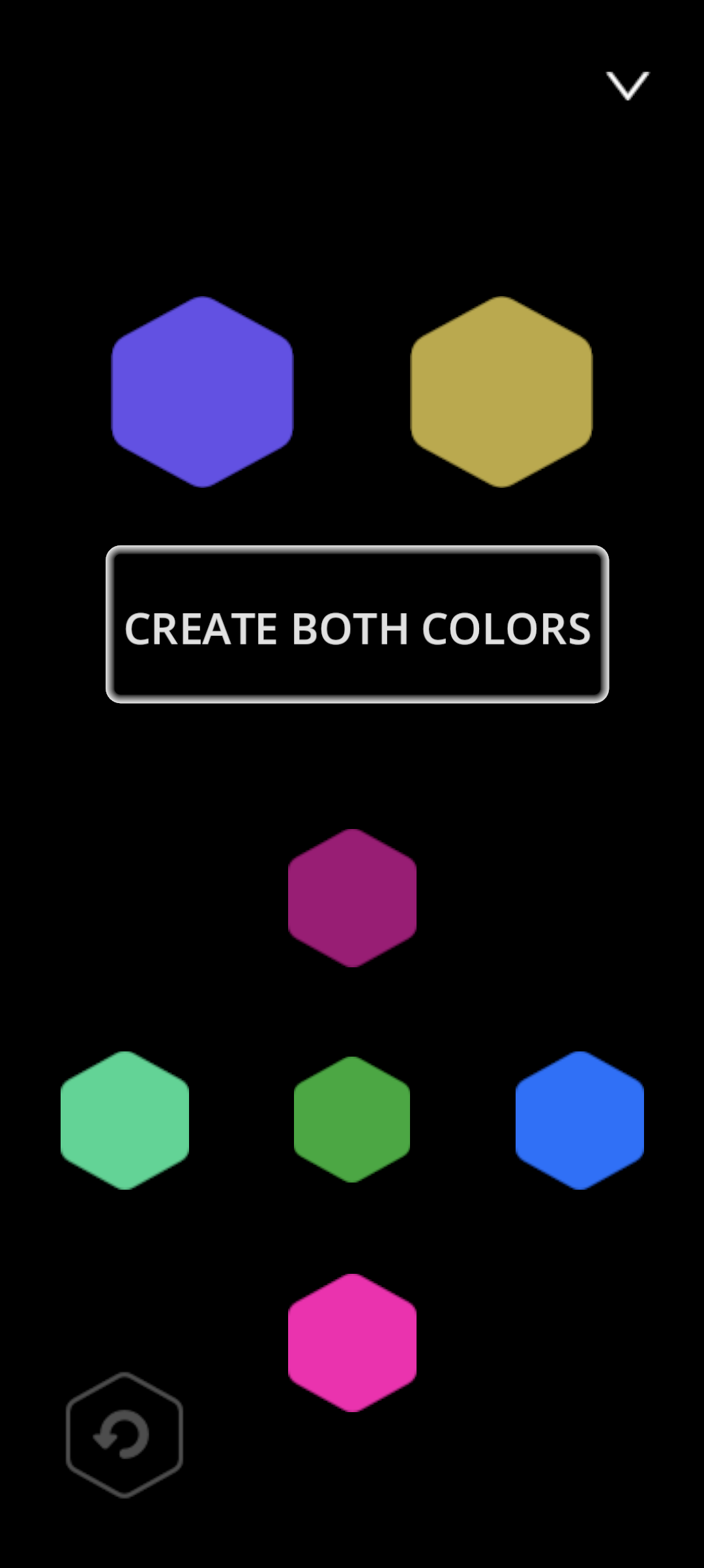
Modes
I ideated on and experimented with lots of different modes throughout development. My goal with modes was for them to be similar enough that players could easily pick them up, but also different enough to create fun variation and options. Most of my modes are variations on the primary mode, except for one which completely flips it. “Invert” came directly out of a playtest where a player said that they wanted to have more color options to experiment with. I prototyped it, and ultimately added it to the game! “Trine” similarly came out of playtest results where I had some players wanting more challenge.
Invert mode gameplay
Systems & Tuning
-
Mixing colors in a smooth and intuitive way ended up being quite the challenge. Adding or multiplying colors gave pretty poor results, so I ultimately determined it was necessary to linearly interpolate between them. This worked well in achieving more “natural” mixing, but also meant that it would be impossible to actually reach the final color since it the mix would also meet at the halfway point of the two colors. To fix this, I made what I called “Color Lerp” where the strength of the linear interpolation depends on the distance of the colors in a parabola function. The further and closer two colors are, the stronger the lerp.
-
I spent a LOT of time working on randomizing colors and the design of what actually feels good there, which resulted in a few different algorithms. The most complex and important one works by using several factors, including how well the player is doing, to determine if the new color will be helpful, which color it will be helpful relative to, and then randomizing within that range. This is a HUGE part of what makes the game feel truly good, and how I balance challenge with satisfaction and ease.
-
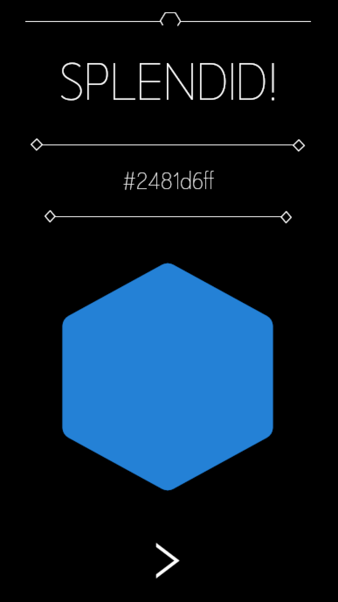
Comparing colors was another area that took lots of iteration to figure out what felt right. Having the colors be EXACTLY the same was almost completely unreasonable to the player, and such minute differences made the game way too hard. Instead I spent a long time crafting a solution that compares colors more accurately to visual difference. The goal here being when they “look the same” to the player, they win, not when they are mathematically exact.
One of the most important things I learned from prototype was the need for VERY fine tuning on lots of elements. Of the utmost importance amongst them was everything to do with color—mixing, randomization, and comparison.
Code samples from my custom color class
Feedback
In early versions of the game there was no feedback or juice to improve the player experience which really diminished the results of player actions. I wanted to make things as smooth as possible with a good experience so I added quite a few elements to respond to player input. I first made it so that when colors mixed they didn’t just suddenly become the new color, but did a smooth transition into it. I also made the fade in/out for menus to give instant feedback to button pushes, a glowing border that appears when reaching a color, and the zoom in/out when selecting a mode and winning a match. Along with these visual improvements I made some important sound improvements like noises on button presses, and when winning the game.
Transitions and feedback
Hidden Features
While developing the game and figuring out how gradients were going to work I had an idea I thought would be fun to pursue: creating gradients of different shapes that have a different styling. I prototyped this feature and found it super exciting, but also realized that a portion of my core audience may not be interested in that level of complexity. So, I made it a little easter egg! It ties into my themes of “discovery” well and is a fun little bonus for invested players who find it. Changing the shape not only changes the gradient, but all of the game’s theming too.

Shape changing example
First Time User Experience
With mobile games, especially free to play the first time user experience (FTUE) is VERY important to hook players on the game and prevent them from uninstalling immediately. I wanted to make sure that my FTUE was as smooth as possible at introducing players to my core loop and teaching them how to play. I storyboarded my entire FTUE in Figma before developing it. I also found that some modes needed additional explaining so I added short explanations to teach the player on the first time loading those modes. Progress on the FTUE and these tutorials is saved to the device so they only appear once and are not intrusive.
Figma storyboard and the final implementation
Engineering
Hue Blend is completely solo-developed, which means that I did all of the engineering for everything you see (and don’t), including the design elements above. Below are a few software engineering portions I thought worth mentioning, but I’d be happy to discuss any other pieces of the game in more depth!
Reusable Components
With multiple modes based on the same concept I needed to make sure that it would be easy to make changes across the board by component-izing as much as I could. For Hue Blend this meant reusable components for the game like the swipable color, target color, non-moving colors, undo button, etc. I also made a few helper classers like BlendColor which contains all the information needed for my complex color operations. This made cross component-interaction very easy and extendable.
System Design
For such a small game Hue Blend does have a surprisingly high number of systems that I needed to organize carefully so they could interact with each other. I made extensive use out of Godot’s autoload system to create singletons that each handle a specific portion of game logic. I have a SceneSwitcher singleton that makes it easy to change the screen, a ColorManager which handles creating/adjusting gradients and colors, a ShapeManager which handles changing shapes, and many more. I worked hard to makes sure these systems were as decoupled as possible to prevent potential issues.
Integrations
As a mobile game, there were lots of important integrations I needed to make to publish onto official app stores. For 3rd party integrations I connected with AdMob and Google Play Services to support showing ads, achievements, leaderboards, progress saving, and in-app purchases. In the future, I plan to create similar functionality for the App Store. I also connected each of these integrations with my own development work, especially progress saving. Player progress and configuration info saves locally to their device, and to their Google Play account, so they can download the app on any supported device and continue playing.
Building
As my first solo-developed commercial game I wanted to make the experience as good as possible for all players, which also meant not taking up too much space for them. As part of this I compiled Godot export templates from source and used build options to reduce the size of my final app bundle. I also added encryption to key source-assets to make sure they couldn’t be accessed easily.